Resources for Book Cover Design
If you have a computer, you have access to everything you need to create your own book covers. Is it going to be free? Probably not… at least not if you want a quality cover that takes you from amateur to professional level. That said, it doesn’t have to cost hundreds or thousands. There are no-cost to low-cost graphics software options, you can get reasonably priced images (free aren’t usually recommended, and we’ll get into that), and free fonts that are licensed for commercial use. Those three things are all you really need to create a great cover. On second thought, let's add a very important fourth...
There are basically 4 things you need to create a book cover:
1. A way to create the cover (Design software and computer)
2. Image/images (pictures, drawings, background design, texture)
3. Fonts (text)
4. Good Attitude fortified by great Snacks!

|
Before you do anything else, you're going to have to figure out how you're going to "create" your cover image. |
There are a lot of options available these days, though the top four are:
|
|
|

|
Photoshop is considered the top dog. In case you haven't heard of it, it's a professional Photo Editing and Design Software from Adobe. Unless you can find an older copy somewhere, you will purchase PS as part of a subscription plan and can find those plans and pricing here: www.adobe.com/creativecloud/plans.html
Photoshop Elements is another option. The price for the latest version is $99.99 and can be downloaded here: www.adobe.com/products/photoshop-elements.html
Photoshop has become more tightfisted since the launch of Creative Cloud, so older products are harder to find. If you need something less expensive but still good, search out an older version of Photoshop Elements. It won't have all the bells and whistles, but you can still create a quality book cover with it. A quick Google search of "Photoshop Elements" with a number behind it (preferably 7 or above) should provide some options. The lower the number, the harder it will be to find a copy.
Affinity is a "one and done" professional photo editing software that can also be used to create book covers. There is a one-time cost of $49.99. I haven't used it, but have heard it can be a good option. The link to find out more: affinity.serif.com/en-us/photo/desktop/
GIMP is probably the best known FREE image manipulation program. Although most professional designers switch to Photoshop, GIMP is a great first step and will allow you to create a quality design. The link to learn more or download GIMP is: www.gimp.org/
Samples of work in each...
Photoshop: Bewitching Book Covers Rebecca Frank www.facebook.com/RebeccaFrankArt/
Photoshop Elements Tell~Tale Book Cover Designs Linda Boulanger www.facebook.com/TellTaleBookCovers/
Affinity: Soxsational Cover Art Tracey Soxie Weston www.facebook.com/SoxsationalCoverArt/
GIMP: Black Widow Books Virginia McKevitt www.facebook.com/vmckevitt/
Once you have your software chosen, you're ready to move on...
Your image(s) and your fonts/text are the two main parts of your cover. If you're going to create your own cover, that's where you need to start.
|
|
Free fonts... maybe. Free images... not recommended.
You can often find fonts for free that offer a commercial license. With stock images, it isn't recommended to use images from free sites. They often do not have the proper releases and many of the images are harvested questionably. That said, you CAN use images you acquire for free through legitimate stock image sites. (For example, DepositPhotos has a selection of FREE images that updates weekly: depositphotos.com/free-files.html). DO NOT GRAB IMAGES FROM GOOGLE OR PINTEREST!
Note: Creative Commons images are a potential exception, though you need to pay special attention to the rules of each image. Some require attribution, others don't, and there are different license types as well. Check out https://creativecommons.org/licenses/
***This is the best explanation I have seen of why to NOT use certain free sites: Please don't use "Free" stock for any commercial product. Sites like Unsplash don't take possession of the responsibility of lawful licensing, unlike paid sites like Shutterstock and Depositphotos.
Sites like Shutterstock take possession of the responsibility to vet their images. They guarantee there is property release in place, or a model release, or a tattoo release, etc. That means that you, as the end user can LEGALLY ASSUME the images you are using are free to use under the terms of those releases. If, say, the model sues you, you can hand over your licensing document and the model has to go to Shutterstock instead. That, and Shutterstock has an arrangement in place so it can compensate you for any costs you incur during this process.
Unsplash and its ilk do not take possession of responsibility, which means that if you get sued, you can't turn to them for compensation or even a license. You have absolutely nothing to prove that you were allowed to use the image in the way you did. If the model can prove that they never signed a release, or even if there is reasonable doubt they did, you are financially liable for the use of the image. And there is absolutely nothing that covers you in any legal way to prevent that from happening.
This is why you don't use images form sites like Unsplash, Pexels, Pixabay, etc. They don't protect you, and images are often stolen from paid sites or they do not have the proper releases in place.*** (Explanation credited to May Dawney of May Dawney Designs)
 |
 |

|

100% Commercial Free Fonts
Offers "Free Goods of the Week"
Freebies and Weekly Specials on
Fonts, Images, Brushes, etc.
|
**Creative Fabrica and DepositPhotos are affiliate links
Boutique Stock Sites
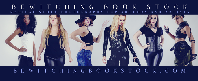
Rebecca Frank's Bewitching Book Stock: www.bewitchingbookstock.com/
Join the Facebook group where she often shares coupons and/or free stock bundles...
The Group Link: www.facebook.com/groups/bewitchingbookstock/
I'll talk more about fonts below, but please note that Becky's font work is beyond amazing, so I suggest studying her covers for ideas of what "true professional" looks like: bookcovers.rebeccafrank.design/photo-covers/
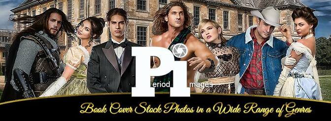
Great stock site for historical images, though they have a variety of genres.
Renee Barratt of The Cover Counts has some great information on Copyright where it concerns book covers and stock images: https://www.thecovercounts.com/blog/
We'll get back to images in a minute but let's talk about something else that is equally as important:
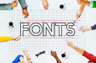
A word or two about fonts...
The general guideline of fonts: Use two fonts on a cover and never more than three. It’s best to err on the side of too few as opposed to too many. You can often change a font by changing the weight and thickness (bold vs. thin vs. regular), or switching part of it to italics.
Size matters. You only have so much space on a book cover, so until you’re as famous as Nora Roberts, Stephen King, or James Patterson, your Title should be the largest text on your cover. If a reader hasn’t read your work before, your name isn’t going to have a lot of meaning to them. Use your space wisely. Let your title and your image hook them.
In order of importance as far as size:
1. Title
2. Author Name
3. Series Name
4. Tagline
Also, give weight to more important words. The word “the” in a title doesn’t need to be as large as some of the other words, for example.
Make sure your fonts clearly convey what your story is about. If you’ve written a book in the horror genre, don’t use a script font. Look at other covers in your genre to see what they’re doing. Then take a trip over to CreativIndie and check out Derek Murphy’s amazing list. He even has a pdf of all those font lists that you can download for free!
https://www.creativindie.com/300-fool-proof-fonts-to-use-for-your-book-cover-design-an-epic-list-of-best-fonts-per-genre/
Nothing says amateur like bad Kerning. So, what is that and how do you avoid it? Kerning is defined as: the spacing between letters or characters in a piece of text to be printed.
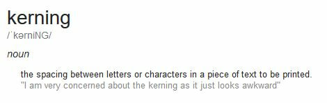
You don’t want that awkward spacing in your book cover text.
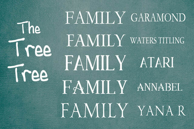
In the examples above, look at the T in The vs Tree (the top Tree, not the bottom). Can you see the obvious difference? It may not actually be different, space-wise, but to the eye, it looks wrong. The way to fix that is to type T in its own box and then ree in its box and put them together, like in Tree at the bottom. That is AndrewScript, btw.
Certain letters almost always have kerning issues. An A that’s next to a more up and down letter, like the FA or AM in the example FAMILY. You can see that it is “off” in almost every font I’ve used. Don’t be afraid to tear your font apart and put it back together, even if it takes typing it in as individual letters.
When you're placing your text, think of the overall cover as something of a puzzle and the text makes up part of the pieces. Play with their placement not only together, but also how they look with the overall design.
I mentioned Rebecca Frank above as an excellent example of a font goddess. Two more that note mention are Renee Barratt with The Cover Counts and Mallory Rock with Rock Solid Book Designs. They are some of the best in the Indie design business.
bookcovers.rebeccafrank.design/photo-covers/
www.thecovercounts.com/featured/
rocksolidbookdesign.com/
Okay, so now you know how to choose your design software, and you know where to get your images (and where not to). You also know you need fonts and have those handy sheets from Derek Murphy at CreativIndie. You can look above to see where you might get those fonts for free (since it's okay to use free fonts as long as you have the commercial license to go with them).
NOW YOU'RE READY TO DESIGN YOUR BOOK COVER
NOW YOU'RE READY TO DESIGN YOUR BOOK COVER
Choosing an image...
DepositPhotos is one of my favorite places to acquire stock images.
++As a side note, you don't actually buy the images from most stock sites, you purchase Usage Rights. Those rights vary from site to site, so it's always good to read their terms and conditions. DepositPhotos is one of those that have super user-friendly licensing terms.
Most images on stock sites are royalty-free. DepositPhotos defines royalty-free as: an image available for use in accordance with the Licensing Terms without the need for additional description or coordination of the place, audience, way of use, etc. When buying an image under a royalty-free license, you receive a non-exclusive lifelong right to use it for your purposes within the bounds stated by the Standard or Extended licenses.
That's the legal stuff, now let's talk about images for your book cover...
Some things to consider when choosing the right image or images to give your reader their first glimpse of what they'll find on the pages of your book:
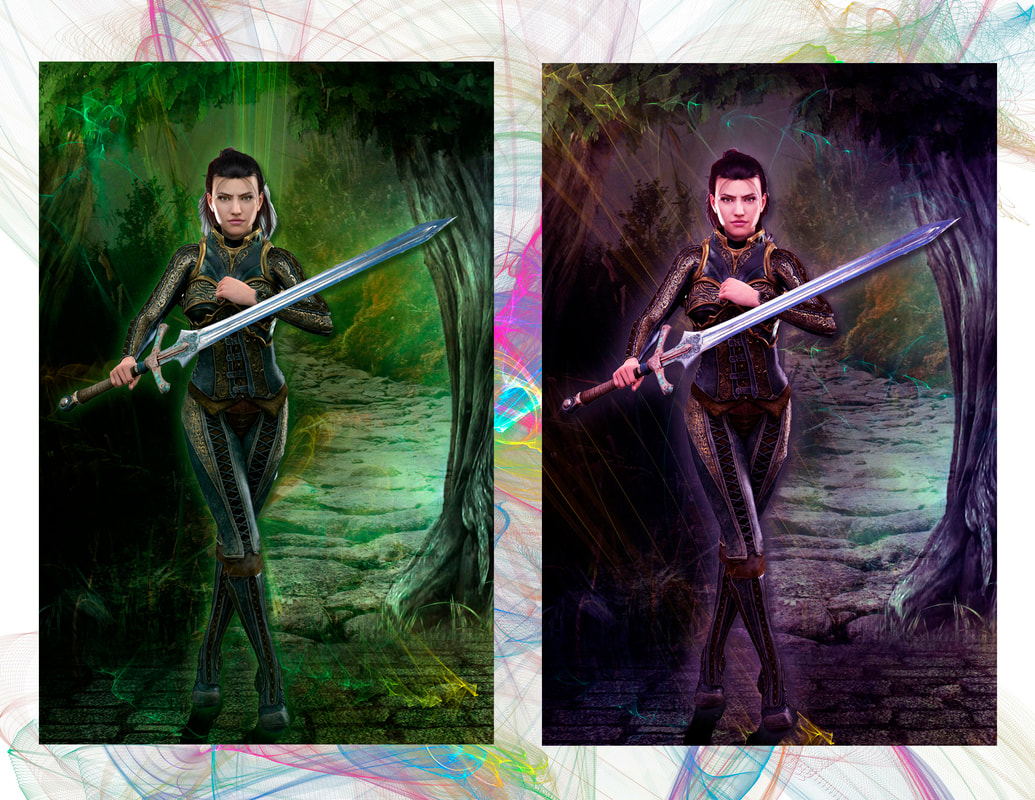
Color matters.
Colors are often genre specific, so choose your colors wisely.
For example, most fantasy covers are done in shades of blues and greens, often with a hint of gold or red. Regardless of the genre, remember that colors can evoke feelings and emotions. Think about that when you're choosing an image or images.
LeiLani Holland has some extensive information about genres specific elements here: customcoverpro.com/Tutorials/genre/
How many images should you use.
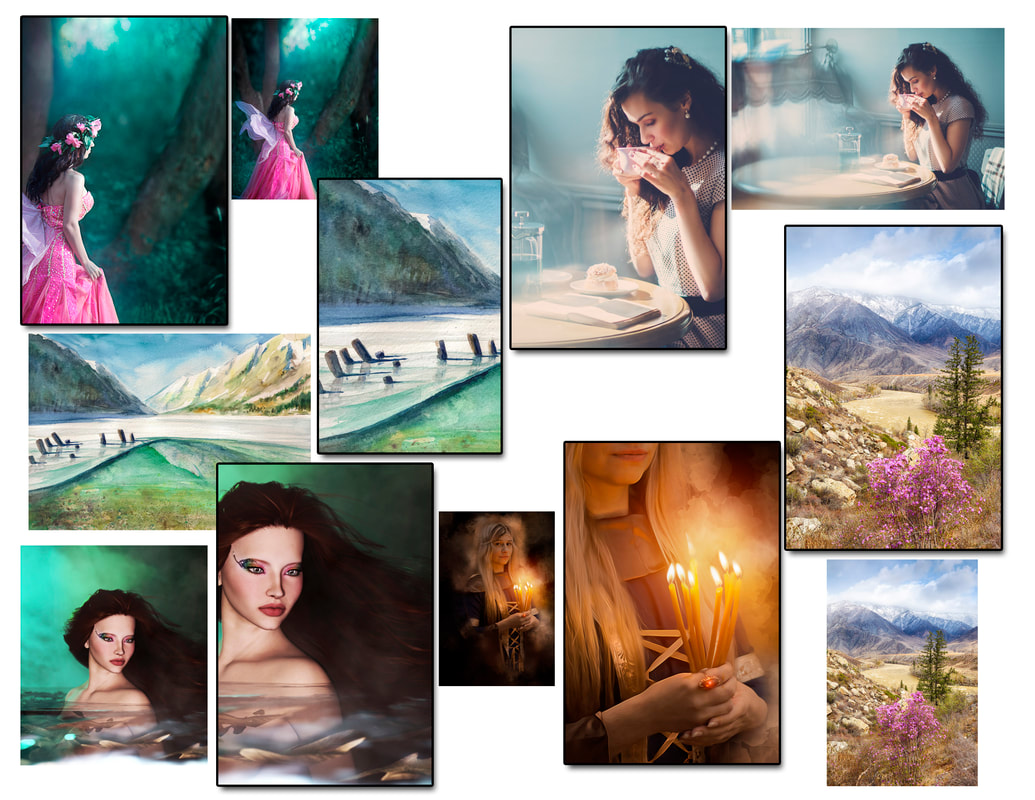
Most professional designers will not use a single image when creating a book cover. I usually use a minimum of 4 in order to create a design that's more unique. I use a process called photo-manipulation and take bits and pieces of different images and put them together to create a completely new image. I talk a little about the process over on Originality by Design in a post I wrote recently: originalitybydesign.blogspot.com/2018/11/mishmash-its-real-process.html
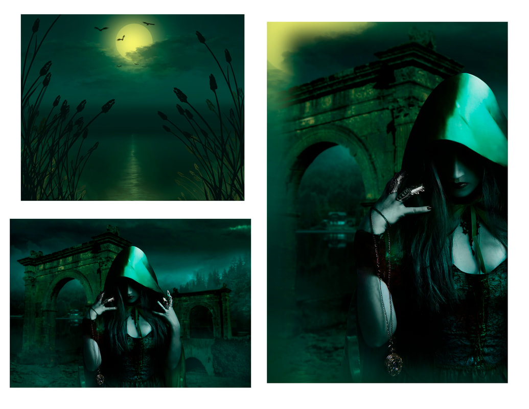
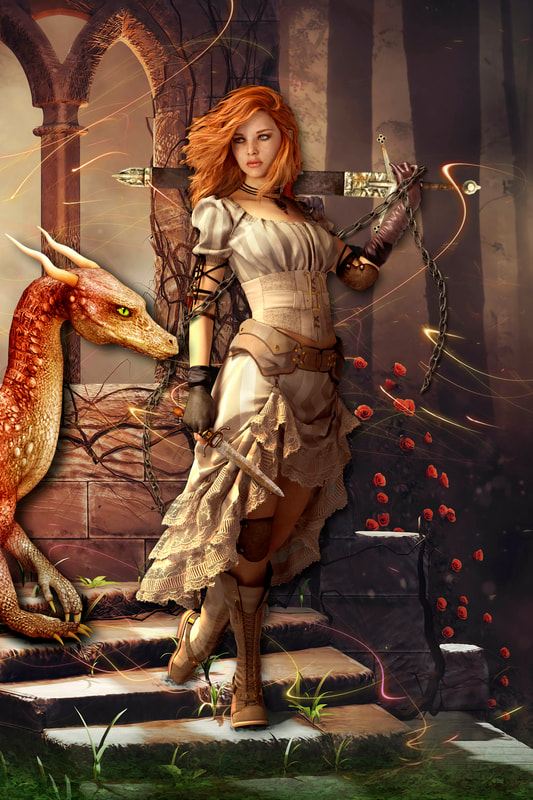
The cover concept below is a good example of an extremely simple photo-manipulation using just two images. I chose my desired image size (I always design my front covers as 6 x 9 and then resize for print, if necessary. 6 x 9 will provide the size you'll need for most eBook distribution sites), pulled the top image with the moon into my design field, then placed the bottom image over it. I had a general idea of what I wanted, though the image of the woman could have easily worked by herself. However, by making simple changes, your cover becomes uniquely yours.
Most professional designers will not use a single image when creating a book cover. I usually use a minimum of 4 in order to create a design that's more unique. I use a process called photo-manipulation and take bits and pieces of different images and put them together to create a completely new image. I talk a little about the process over on Originality by Design in a post I wrote recently: originalitybydesign.blogspot.com/2018/11/mishmash-its-real-process.html
The cover concept below is a good example of an extremely simple photo-manipulation using just two images. I chose my desired image size (I always design my front covers as 6 x 9 and then resize for print, if necessary. 6 x 9 will provide the size you'll need for most eBook distribution sites), pulled the top image with the moon into my design field, then placed the bottom image over it. I had a general idea of what I wanted, though the image of the woman could have easily worked by herself. However, by making simple changes, your cover becomes uniquely yours.
This is what I would be looking at if I was using Photoshop Elements 7 to create this design.
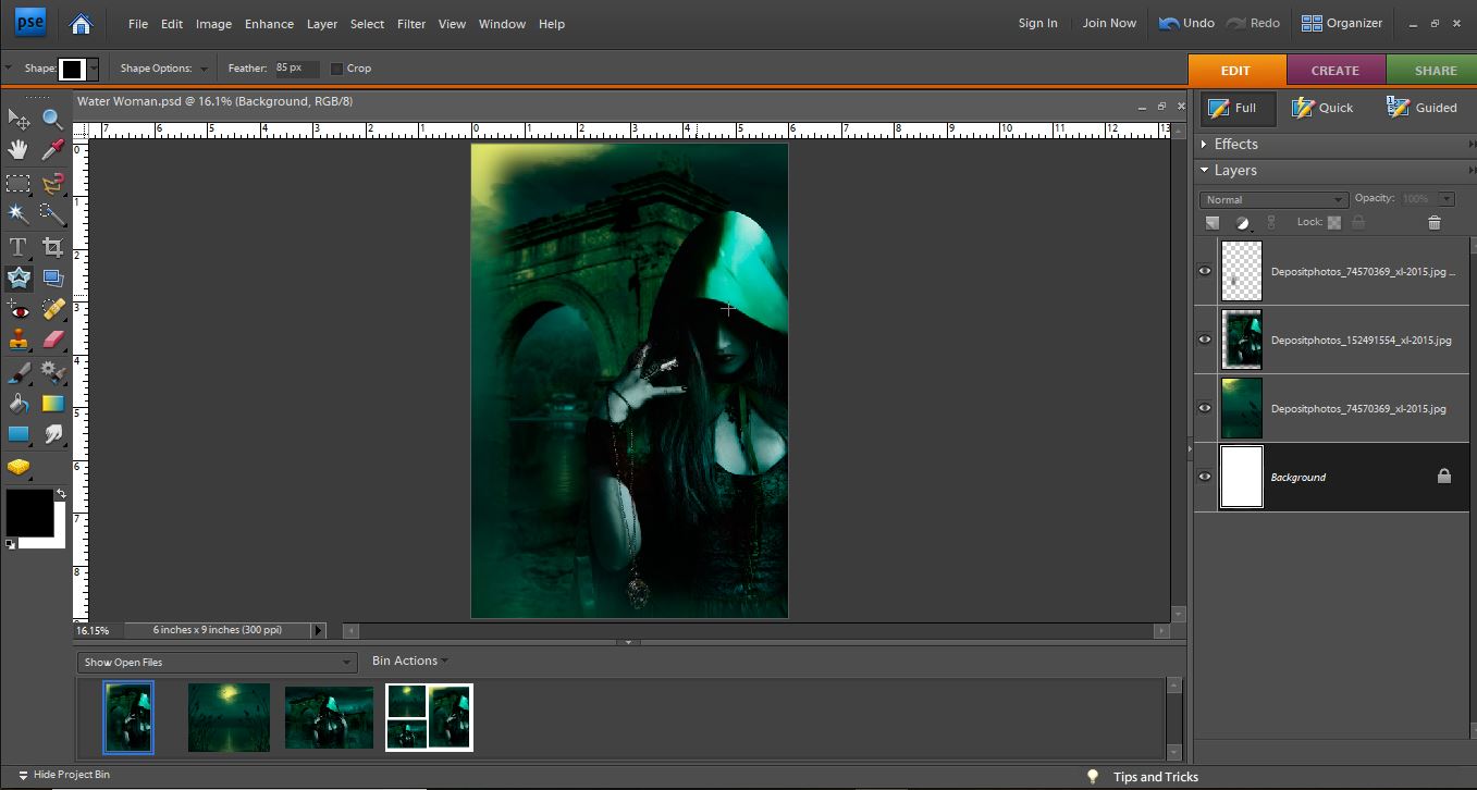
The star shaped tool to the left side, set to 85px feather, is all I used to create this design.
In the end, I decided I wanted the moon reflecting in the water. I used the same technique of pulling that image on top of the others and using the "Cookie Cutter" with high feathering to get rid of everything else.
In later versions of Photoshop, you have the option of using a Layer Mask technique which is considered non-destructive, though since you should never work on your original image (or at the very least, save your work under a different filename), you're not really harming the original. You can find free tutorials on Layer Mask use, such as this one: youtu.be/h5yW5hHjQrE
If you choose to use photomanipulation, a couple of things to look out for: make sure you images don't look like stickers. Don't cut something out and just plop it on top of another one. Be sure to soften or fade the edges, or give it a glow. Blend it to make it look like one cohesive image. Blow it up on your screen and look for little details that need fixed.
CAN I USE JUST ONE IMAGE?
Of course you can! The issue there is that many others may use the same image. But there is nothing wrong with doing so. You might consider thinking "outside the box" with individual images. Flipping them around, making them larger, only using one part of an image are all ways to get individuality out of a single image.
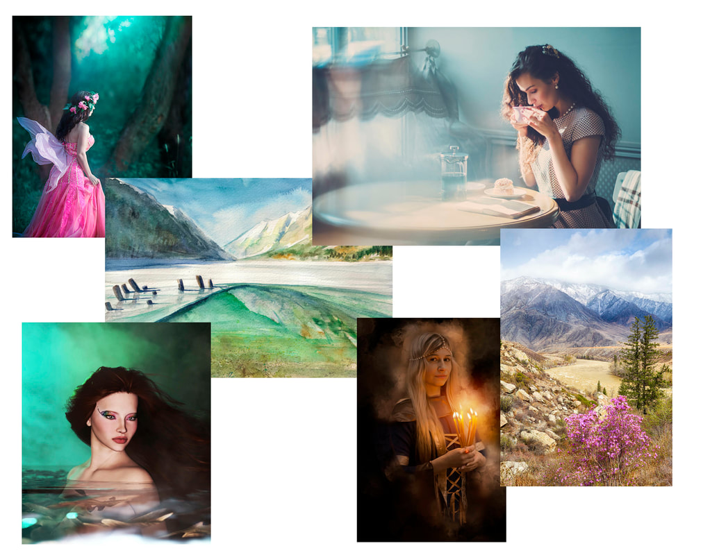
A few individual images that might work well for book covers...
Of course you can! The issue there is that many others may use the same image. But there is nothing wrong with doing so. You might consider thinking "outside the box" with individual images. Flipping them around, making them larger, only using one part of an image are all ways to get individuality out of a single image.
A few individual images that might work well for book covers...
|
|
Overlays are an easy way to add pizazz to your cover. You can often find free downloads of sample packs, like the one from InkyDeals: www.inkydeals.com/deal/17-high-resolution-photo-overlays/ Play with them and if you enjoy them, grab some more, but first be sure to check the web for coupons. You can usually find at least a 10-15% off coupon for most of the sites. You'll find one for Inky right on their site... alienwp.com/inkydeals-coupon-code/
|
|
The covers above all use the same overlay, but in different ways. Get the free set and play around with them!
One last hint to make sure your cover has a more polished, professional look...
If you're creating a full cover, don’t leave your back cover text left justified.
Unless you have a specific reason not to, you want it to be as uniform as possible.
Create a text box and justify it.
PC: CTRL+SHIFT+J will justify your text in your textbox.
Mac: Cmd + Shift + J
Full cover templates can be found at: kdp.amazon.com/en_US/cover-templates
LeiLani Holland of Custom Cover Pro has set up a group as well as a site for aspiring designers
Facebook Group: https://www.facebook.com/groups/bookcoverdesign101/
Tutorial Website: http://customcoverpro.com/Tutorials/index.html
Blog: https://www.coverdesignstudio.com/blog/
Facebook Group: https://www.facebook.com/groups/bookcoverdesign101/
Tutorial Website: http://customcoverpro.com/Tutorials/index.html
Blog: https://www.coverdesignstudio.com/blog/
Learning Photoshop...
While learning any of the design software packages will take time and use, you can always find tutorials online and I recommend spending a block of time going through as many as you can. Some are free, some aren't. Here are a couple that I have used:
Photobacks often has weekly free webinar tutorials that are super easy to follow and informative: www.photobacks.com/
Udemy has excellent tutorials. They can be a bit pricey and long, but they know their stuff: www.udemy.com/
